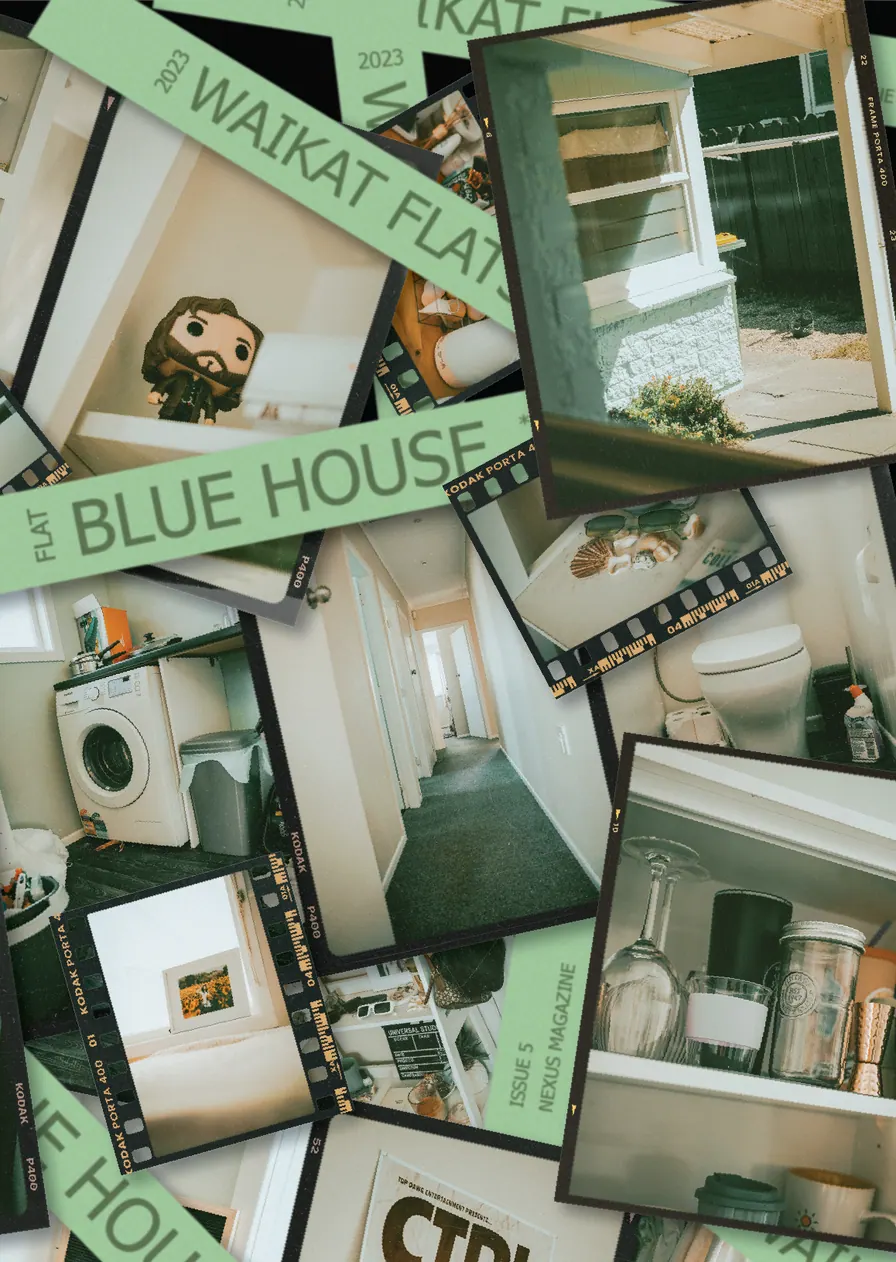
PrintMagazines
No, its not “dead” yet
This project is less about a single design and more of an ongoing pressure test. Nexus is a student-run magazine published every week during the semester, meaning around 24 issues a year. We typically have four days or less to gather everything from the writing team, chase down images and assets, design the entire issue, proof it, and somehow get it out the door looking polished.
When I first joined, I was part of a three-person team, and we were all fairly new to the process. Somehow, we figured it out. These days, I’m more of a shadow behind the scenes, managing and supporting the design team as they bring each issue together, but I still get to jump in when needed.
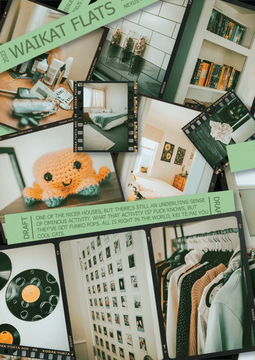
Here are some of the designs and issues I’ve worked on over the years. Just a heads up, Nexus is a student magazine, so some of the content and designs can get a little unhinged. That’s part of the fun.
A Four Hour Challenge
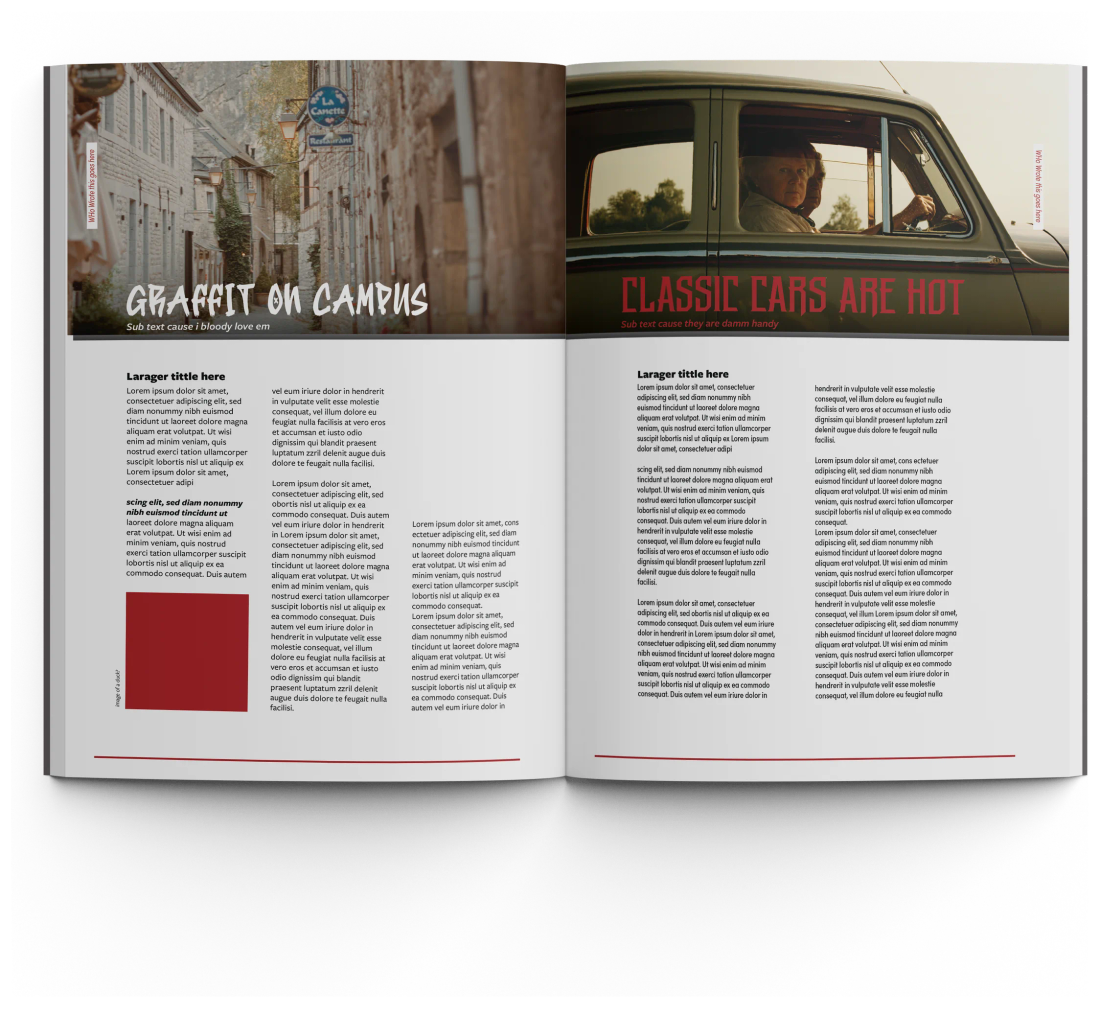
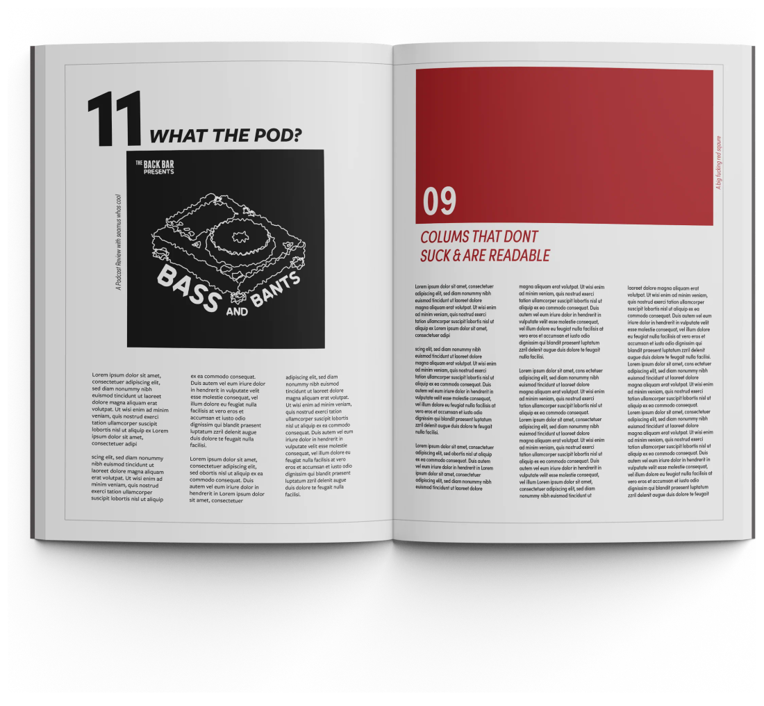
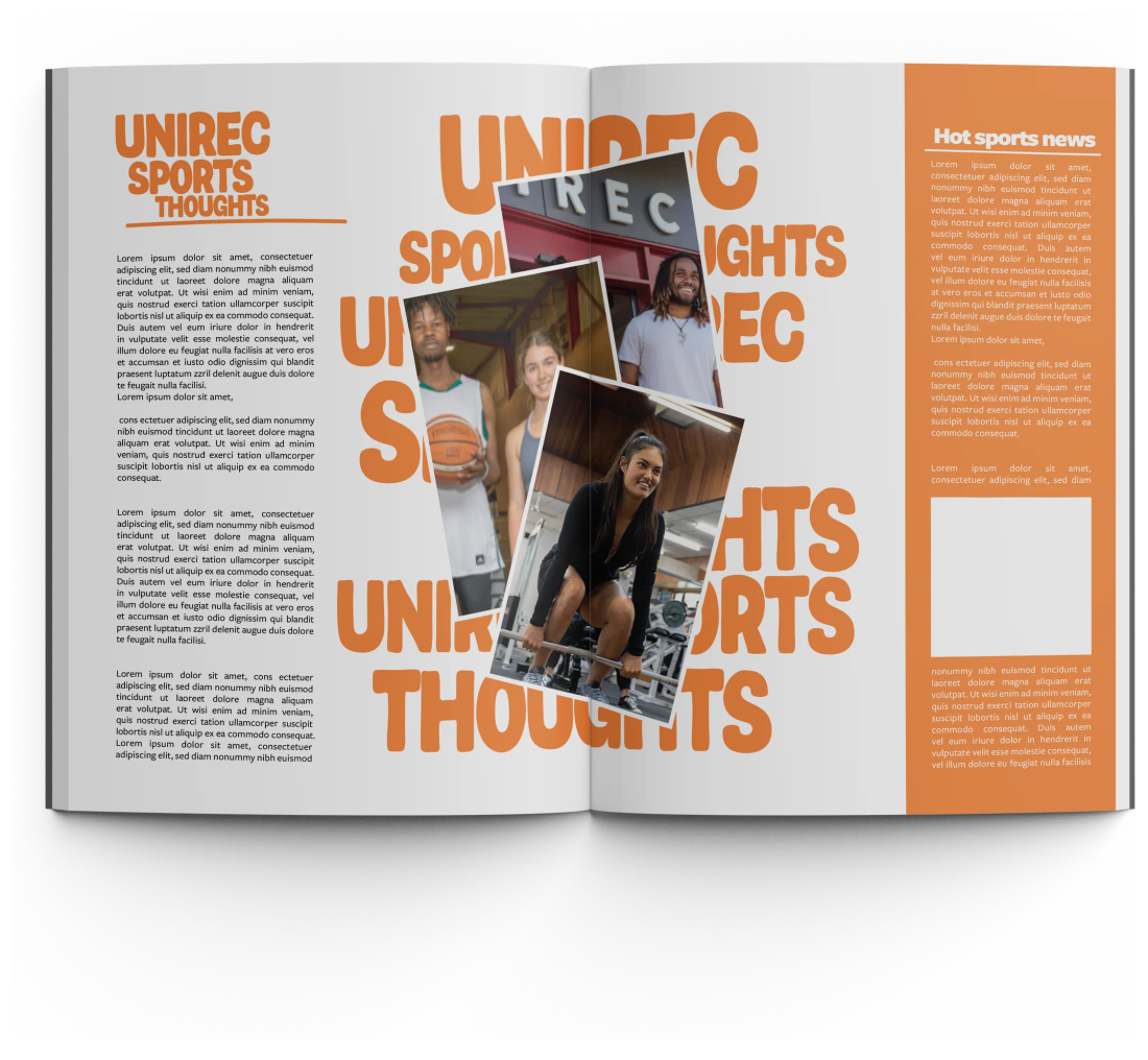
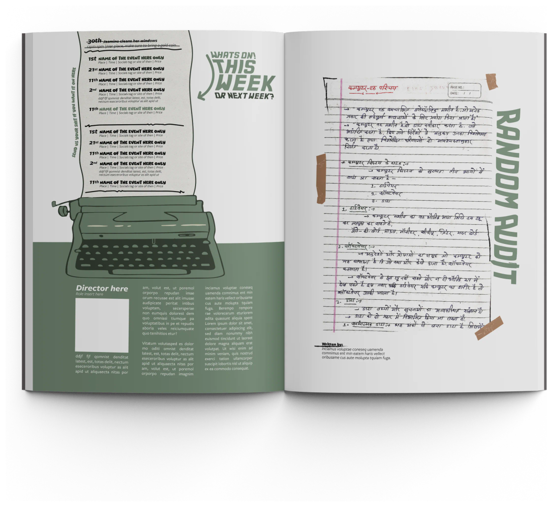
Here’s a look at some of the rough work I put together in just four hours. The challenge was to create a red or two tone colour driven concept for the next generation of Nexus magazine.
Everyone on the team was given the same brief, with eight hours to develop their idea. I decided to give myself half the time. Having more experience with the magazine, I wanted to see what I could come up with under a tighter deadline and let the idea do the work.
We ended up taking elements from everyone’s concepts and combining them into the next direction for Nexus. These are the rough speed concepts from my take on the challenge.
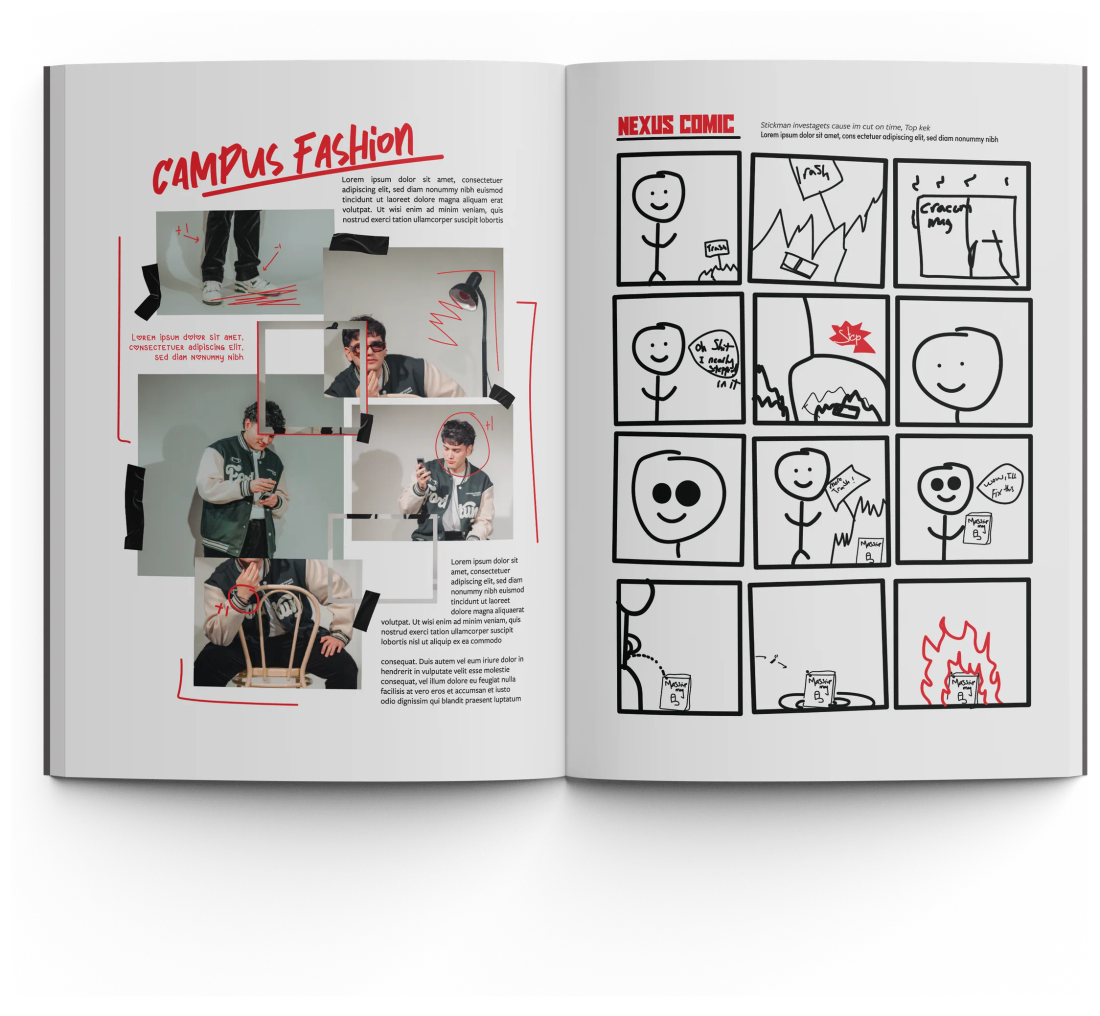
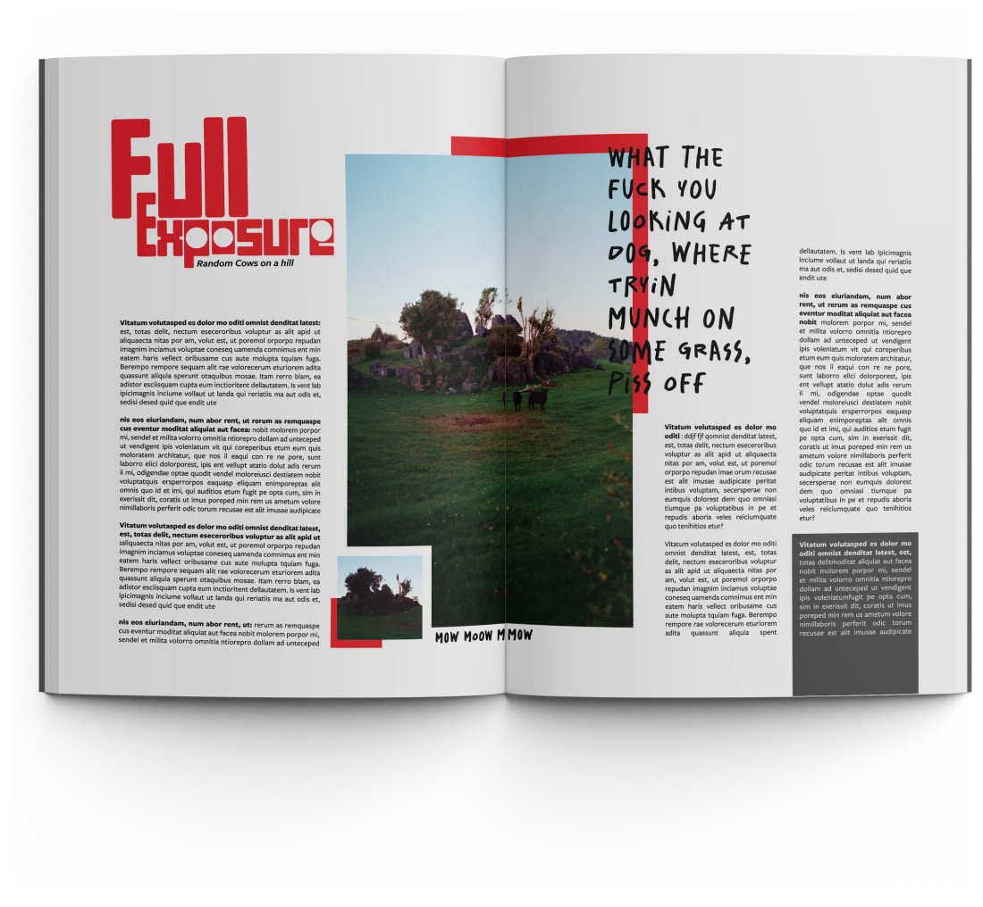
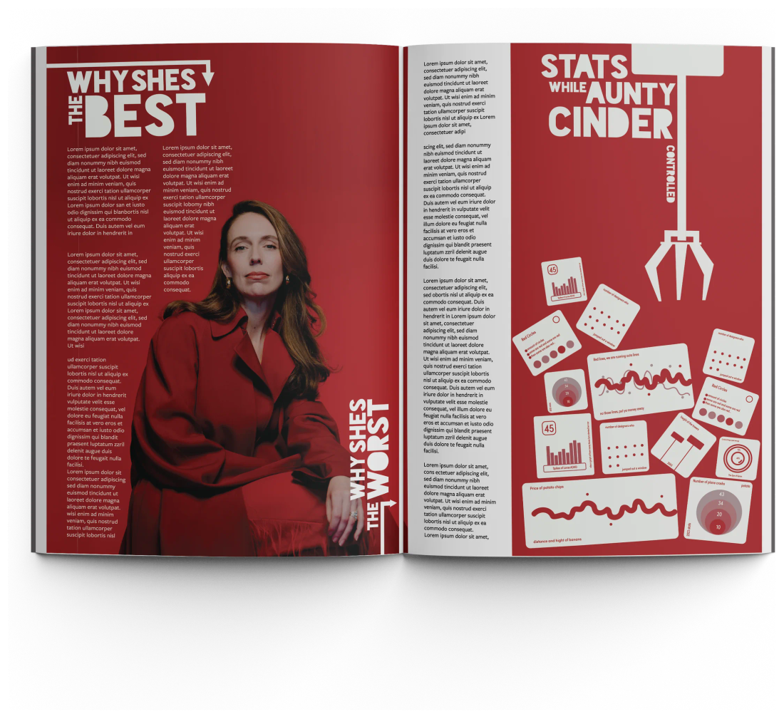
How the layout goes together
Every spread starts as a pile of cut-outs. Scroll to lay both pages back down at once, in the order they were built, from the rows that ground them to the labels that sit on top of everything, and then the finished thing itself.