Campaigns
Lets go though the process of one
I love a good campaign, especially one that collaborates with another brand. The rules governing another brand’s colors and logos do create a bit of a box around you; however, it is this that challenges me to break free or think, "What could I do?" In this field. I’ve been fortunate to work on a wide range of campaigns of varying sizes. However, the majority of the campaigns I do now are digital videos with some minor print work, as this is the direction of social media, so a lot of short-format videos are churned out quickly until the goal is met.
Anyway, enough rambling; let me walk you through a classic campaign I created. I’ll go through it like a process book, so if you just want to see the pretty pictures, scroll down and skip the text. Oh, and a fun little fact: I started this project as a rough concept (wasn’t sure if it would go through to the final stages) and then left for a holiday only to come back and catch covid, and that concept was green lit, giving me 2-3 weeks to finish it while battling covid…
Logo
3 logos, one master logo that both parties will share and use, and 2 additional logos created for each brand to use, resulting in a distinct difference between both weeks. The logo must also have the date built into it while also being easy to read from a distance


Color


The main brand colors are to be used throughout, Red representing the University of Waikato and yellow representing the Waikato Students’ Union. An additional color was added later in the process to distinguish the Tauranga campus from the Hamilton campus. Blue was ultimately chosen as the secondary color
It was also decided that the official brand logos of anyone else involved in the campaign would be displayed in black or white, while the standard use case for everyone’s logo would remain.
Concept to final
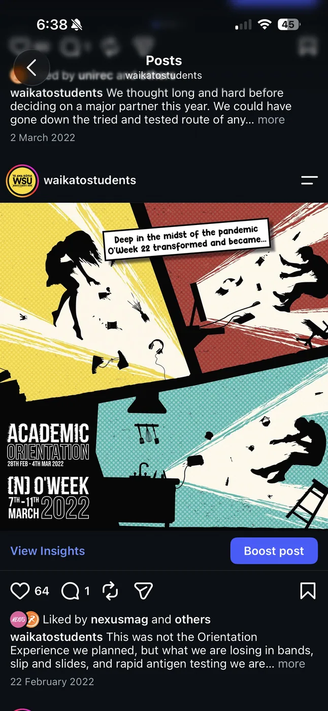
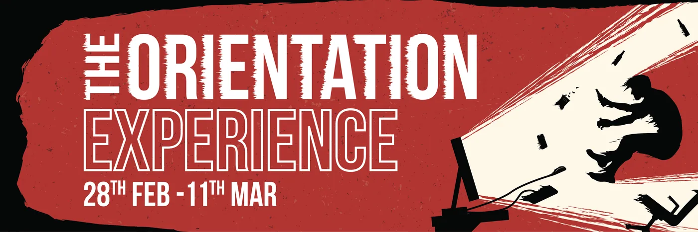
This concept was about capturing the excitement of returning to campus after lockdown. Basically a silhouetted student is shown interacting with a digital device, But the energy of university life bursts out from the screen around them, throwing them back. Events, activities, and social experiences become almost overwhelming, representing the sudden shift from being stuck at home to having an entire campus of experiences available again.




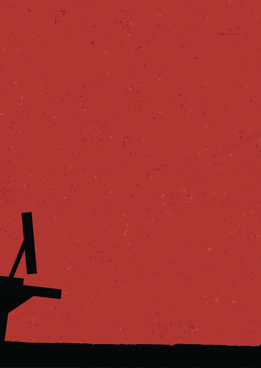
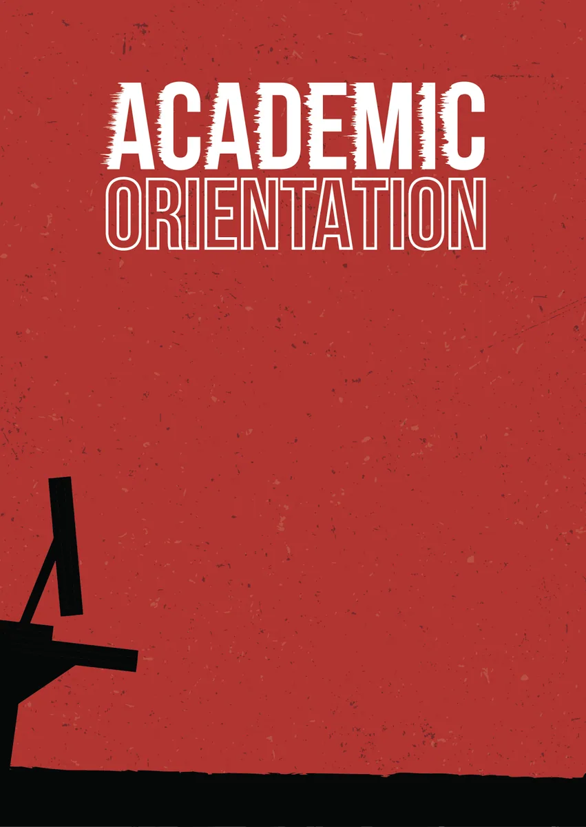
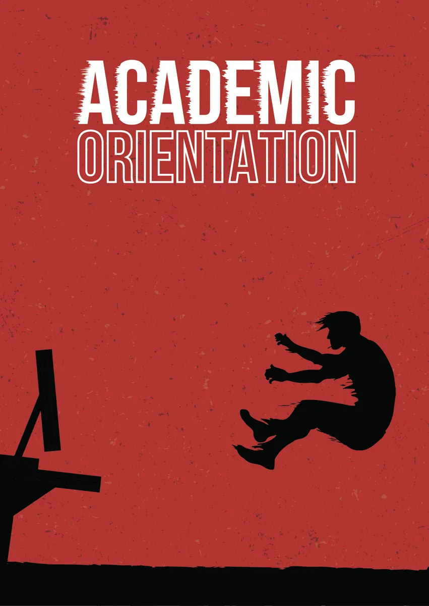
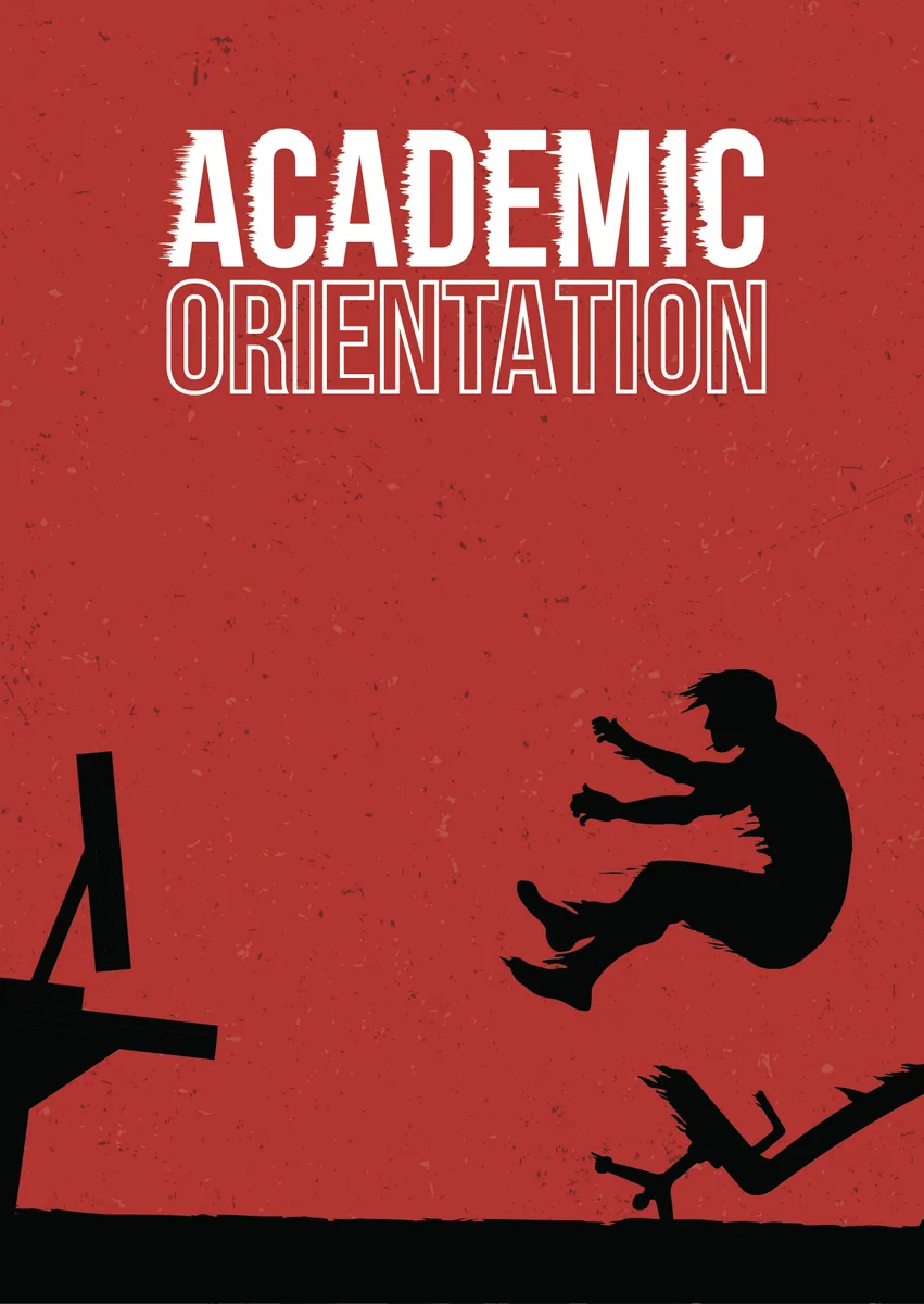
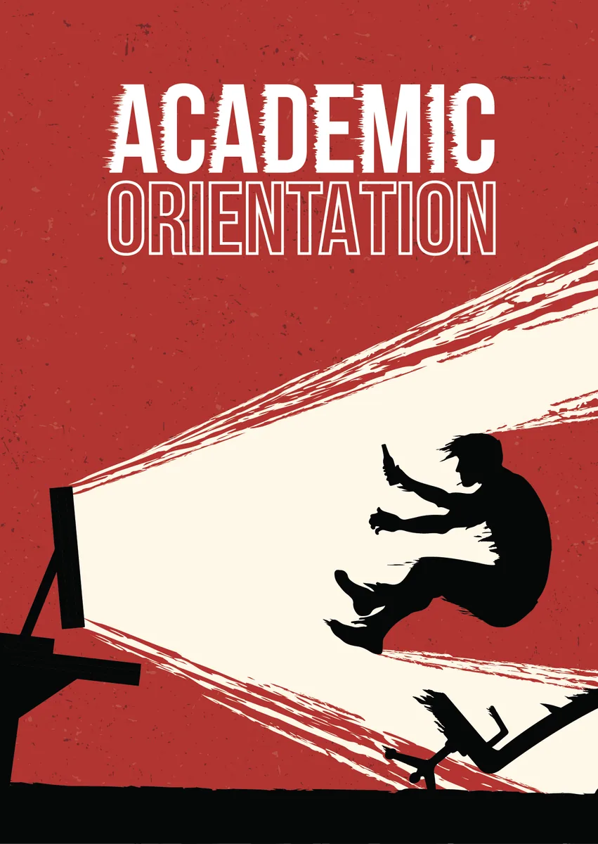
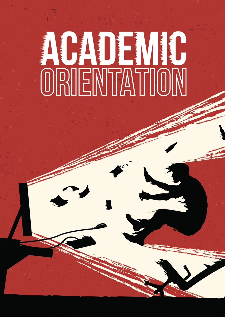
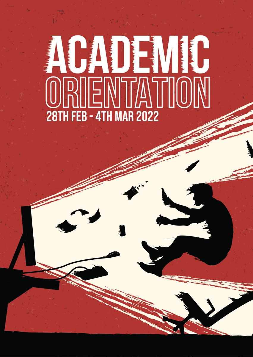
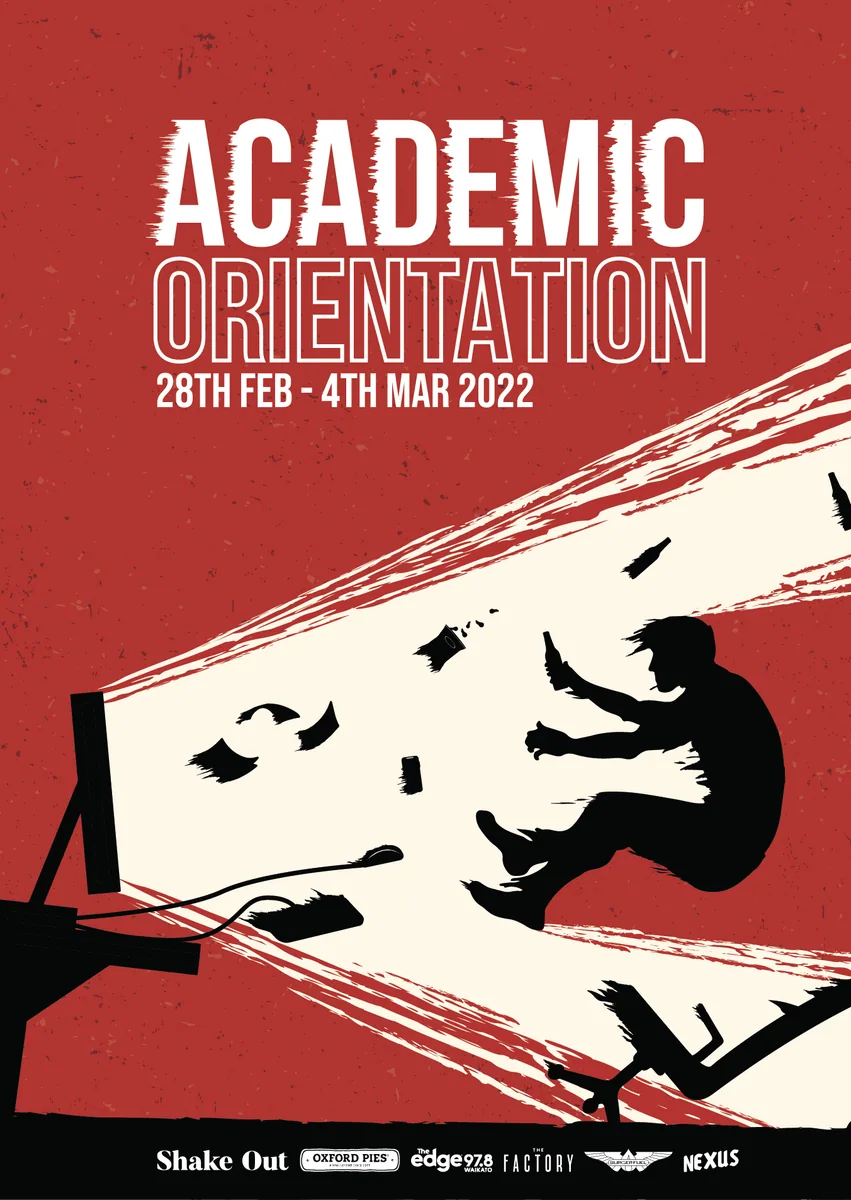
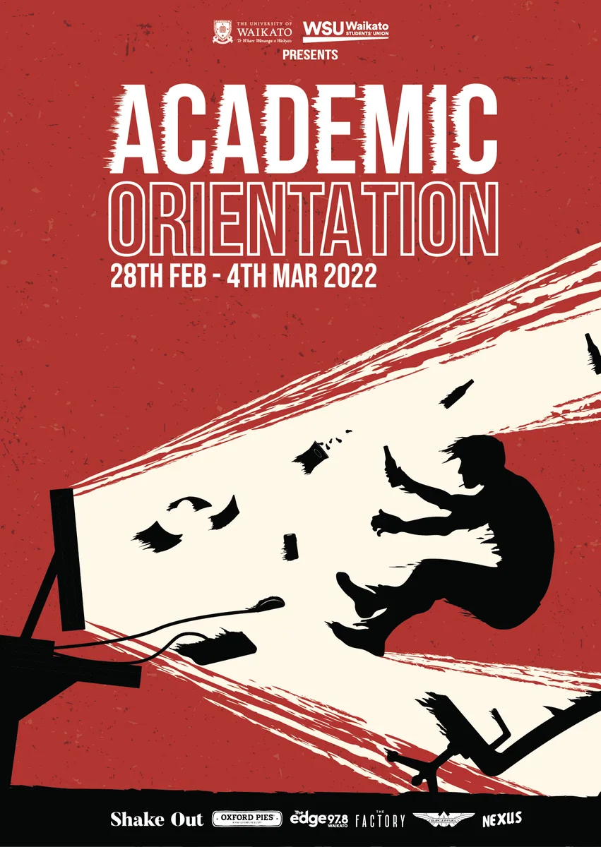
Core Brand Color
Digital Device + Energy blast
Logo placment centered + Dates
Figure / person
Event elements
Additional brand sponsors
Main 2 Brand Logos
The visuals were created to convey excitement, energy, and the sense of finally being able to get back out and experience university life. Finally, each poster had a different layout, which was done to create further brand differentiation as well as to show off/reflect the events that each poster could be hinting at.
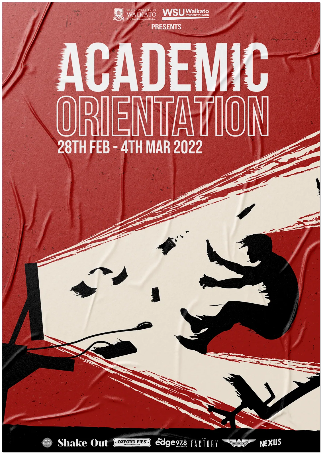
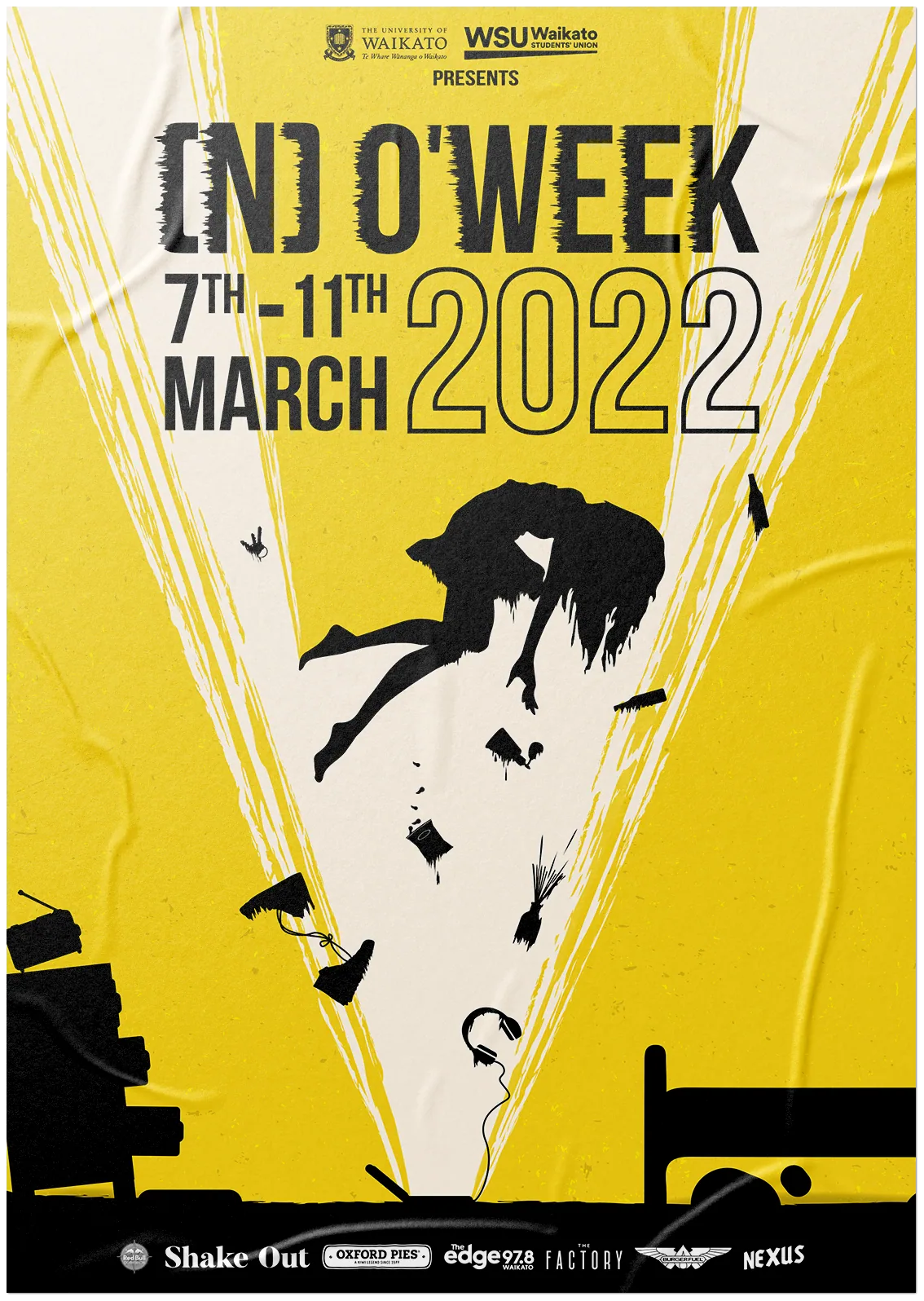
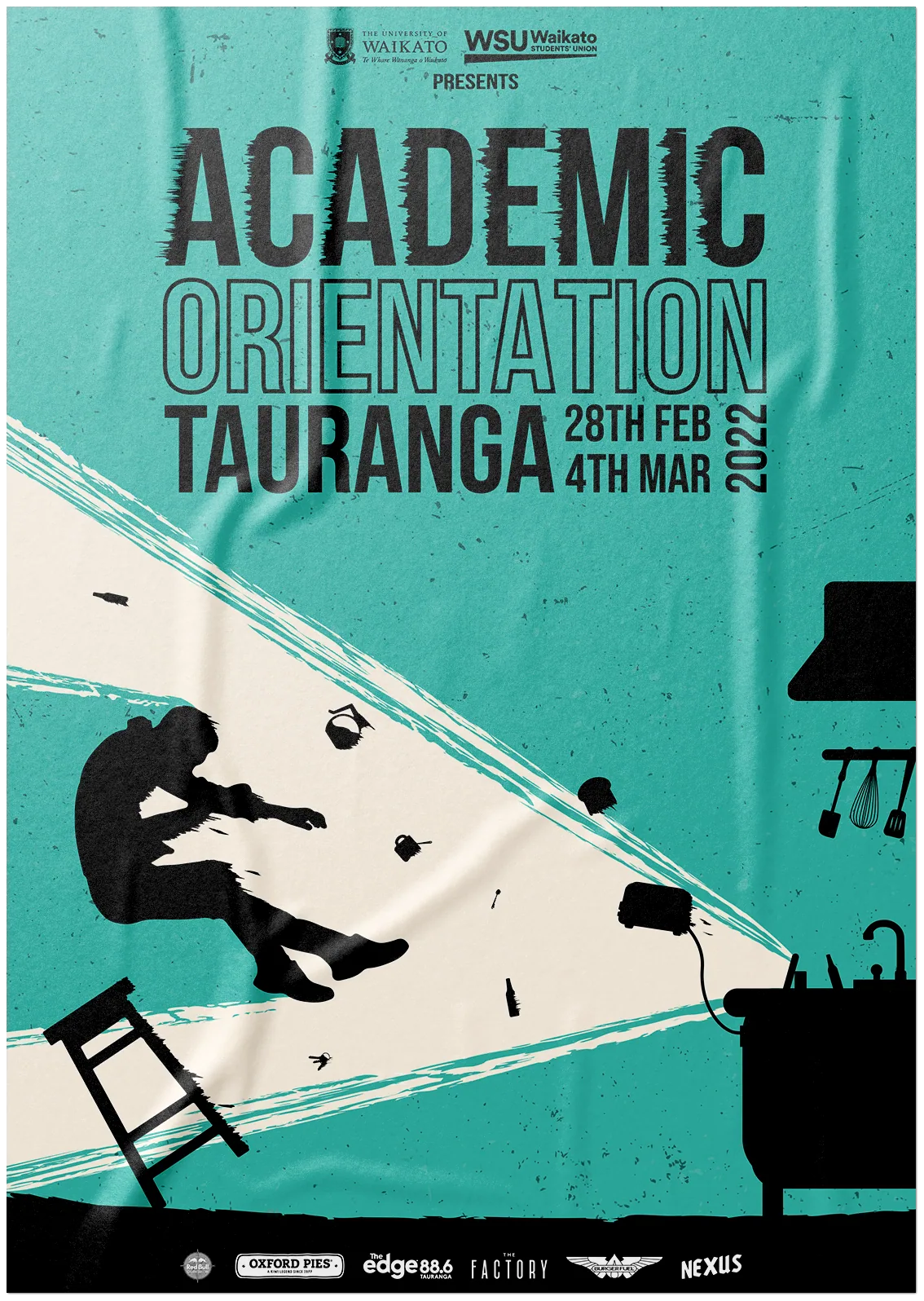
From base to assets
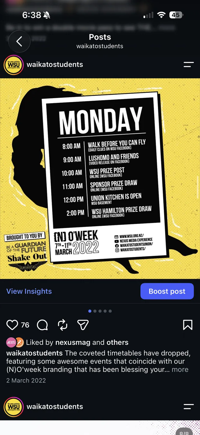
Once I had all of the base posters created and approved by everyone, the next step was to rework them into a variety of assets. This began with designing a layout/theme that could be carried throughout the rest of the campaign, allowing me to combine two core color themes and events. In short, I came up with a comic theme for the design and used sharp lighting cracks to create a split.

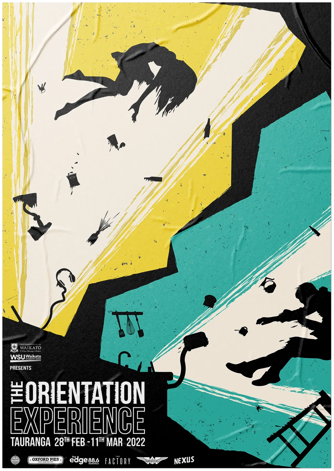
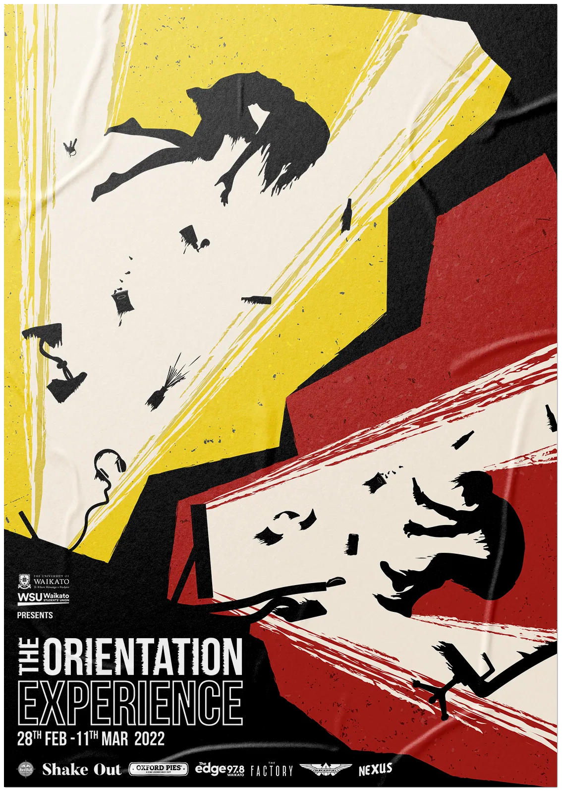


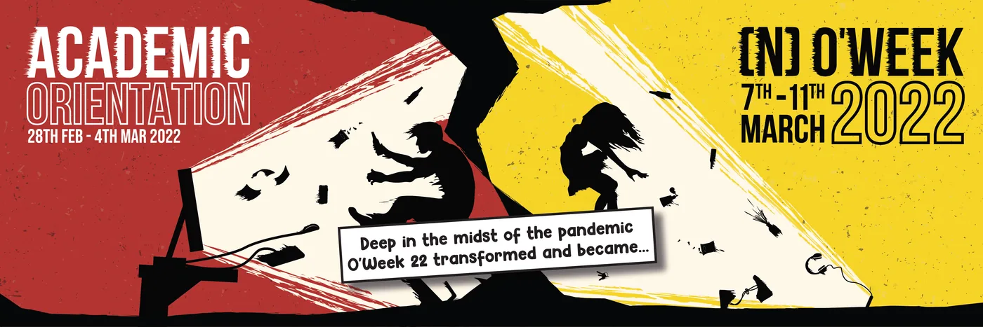
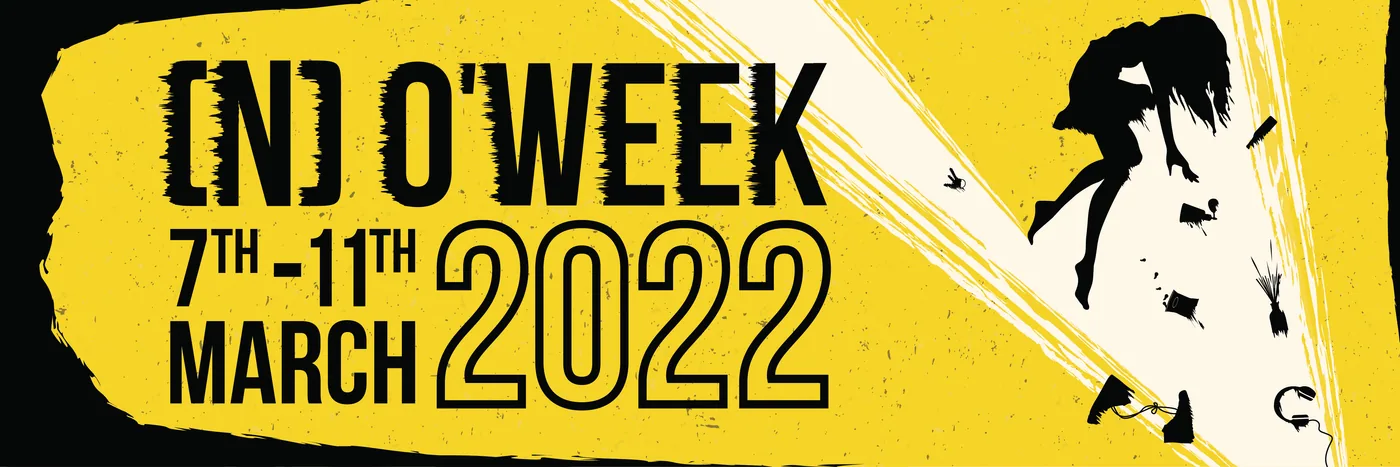
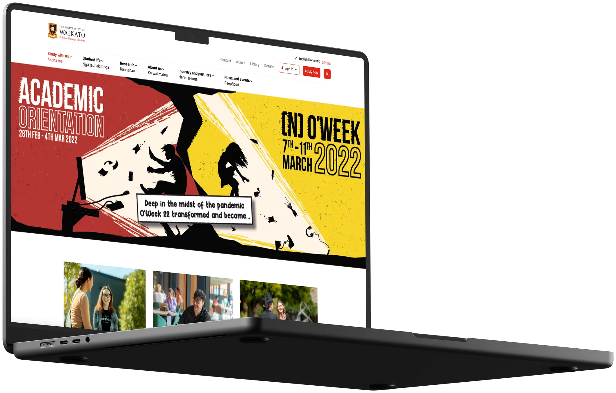
Website:
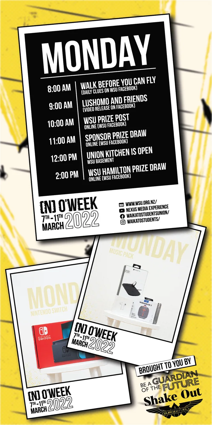
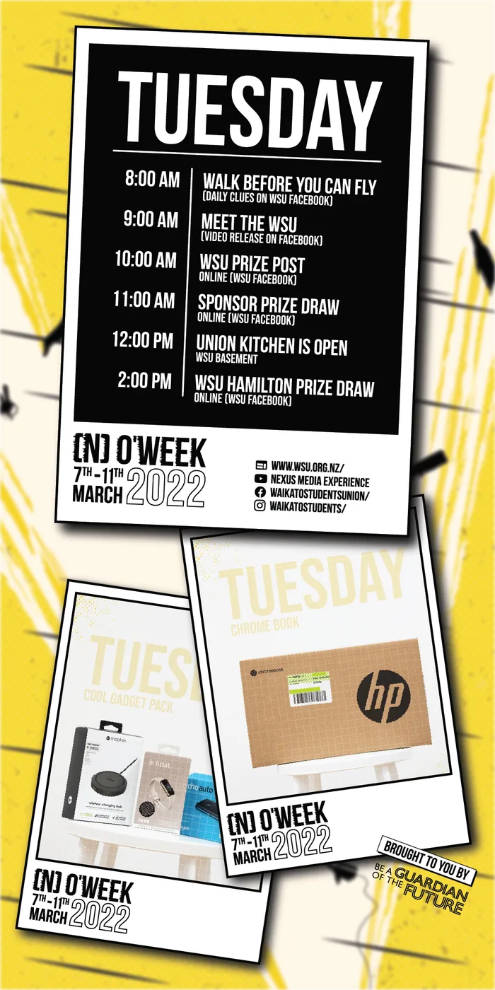
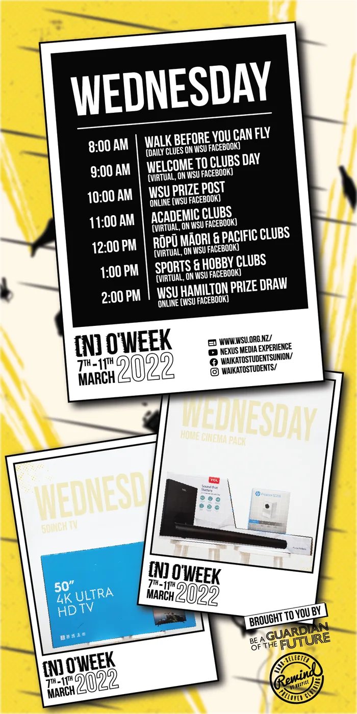
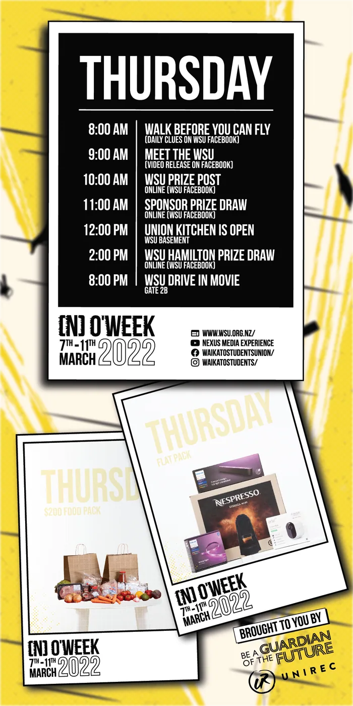
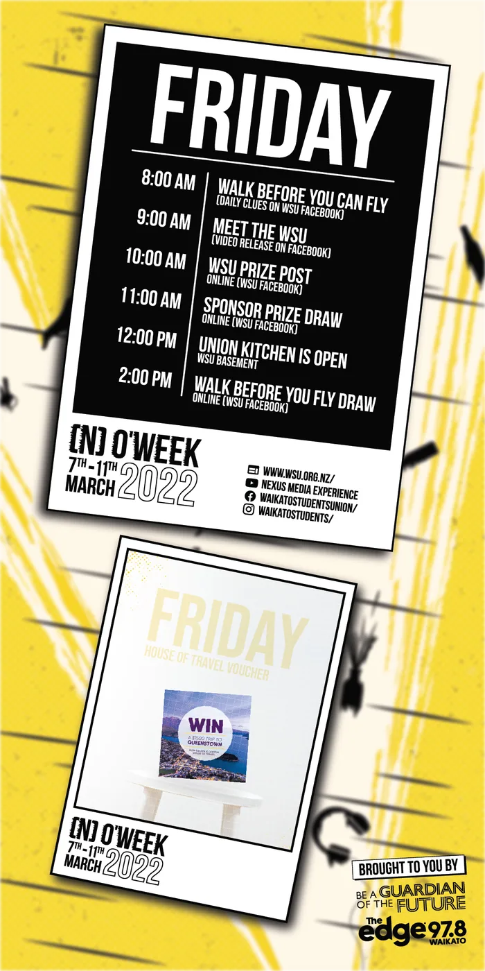
The website banners were made to be interactive with some small animations built in, so if you clicked the banner, it would take you to a separate page in which it showed each day’s timetable (a full list of the interactive events we would be running) and what the students could win as a prize.
Phone app
Breaking down the posters and preparing the assets for the development team was straightforward; however, it quickly became clear they needed more direction on how to carry the brand style over to the app, as they were struggling with how to layout/use the assets. After several rounds of emails and feedback, I took the initiative to create a layout guide showing how I would use the assets, along with additional elements designed specifically for the app. I added annotations to demonstrate the intended movement and functionality, giving the team a clearer idea of how students might interact with it.
The feedback was positive; it reminded me of the importance of explaining the creative work to other teams who would be implementing it, as well as the whys behind the branding style. The app was eventually rebuilt with a simpler, more user-friendly layout, interactive elements, and a few Easter eggs for students to find.
Phone app that shows off the timetable in an interactive layout